19 March 2012

Plan of the week

So the plan last week was to finish my NHS logo so I could move onto other briefs and I am happy to report that I have indeed finished the logo. Actually I did more than one logo but still its done and I can move on.

Here are some of my logos I did the bottom one first, its a bit obvious and you can clearly tell what my inspiration was the top logo is a bit more subtle and based on the shutter mechanism of a camera, I like the colors the blue and yellow especially, the green could be tweaked a little but when I always look back on work I've done I always see what I could change to make it better which is not a bad thing I suppose, just a fact of life you can always see your mistakes when looking back.

So this weeks plan, well there really isn't one because its the Easter holidays and I'm starting my placement so the next post I do will be all about my time at a real design company. Wish me luck.

13 March 2012

Plan of the week

So my plan for last week was all about getting into the new briefs I've been given, updating my blog and trying to do a few posts, which I achieved. I had a contextual graphic design lesson today so that means that this week I'm ready to pick an essay question and start writing a rough draft. 

As I have a lot of different things going on at the same time for the course I have decided that this week will be dedicated to the NHS brief and designing a logo, I hope to have this brief done by the weekend so I can move onto the next brief. Next week I then plan on moving on to another brief this way it is not much of a juggle between a lot of projects. 


A work placement update, I talked to the course leader today as the dates and company that I am going to have changed. My placement will be on the 2nd of April, so next month which gives me more time to devote to the course briefs.

11 March 2012

Kerntype - a kerning game?

So as I was aimlessly stumbling from one website to the next, my procrastination rearing its ugly head. I happened to come across a link to a nerdy kerning game no less. (I though this couldn't possibly be true, but alas a wonderful man called Mark MacKay had made it so)

Your mission should you choose to accept it is simple: achieve pleasant and readable text by distributing the space between letters.

http://type.method.ac/?again

I got 89/100 on my first go, why don't you give it a go?

9 March 2012

Brand yourself...

So last week the tutors gave the whole class a task to research some examples of personal branding and then to try it for yourself and come up with a logo. During the research I found that the people who use personal branding most are usually fashion designers. The reasons for this is that nowadays fashion designers use branding a lot to help market and sell their designs, so having a brand identity similar to what large clothing company's have makes sense. Also I've seen a trend that some very big name fashion designers take Vera Wang for example use their brand to help them move into other retail areas such as home furnishings, footwear and luggage (weirdly enough).

I've found that personal branding it is very important when it comes to succeed in any field. The only problem with the task of branding myself is that I don't have a clear graphic identity yet, I'm in my first year on this course so compared to other graphic designers who have had years to perfect their craft I'm just a novice barely starting out. It might take years for me to finally be able to fully understand my own graphic style and maybe then I can truly look into my own personal branding, but until then I still had a go at the task just to see what my mind could come up with.

And I have no doubt that 5 years from now when I'm doing my real personal branding I'll look back and cringe at what I came up with...so here it goes it started with rough sketches.


Maybe just initials?
Am I a little retro?
Perhaps more casual with an asterisk?
Or slightly resembling the M&S logo?
Maybe I'm bold and eye catching, how about cursive?

So I did the task and branded myself and I can honesty say bring on the next 5 years because I don't have a clue. Maybe just initials?

6 March 2012

Very random but cool pictures...


  Mario, the Man, the Legend!

I would so love this costume, screw Halloween I'd wear it everyday

  Lego humor, gets me every time. ^^

Old camera lovin'...

Who doesn't like pictures of cameras, its a bit like typing google into google.


As promised...

I said that part of my plan of the week was to do some posts on some cool stuff I've come across on the web, most images are from Tumbler.


Briefs aplenty! + Plan of the week

Sooo in this post I’ll be telling you all about the new briefs I got assigned today and also what my plan of this week is.

Firstly today was very busy, it started out with a contextual graphic design lecture on the subject of ‘interactive graphic design and multi-media’ it was really interesting actually. The lecture covered a wide range of things from the invention of printing and how it changed graphics to the amazing people who made the very first programmable computer. I took lots of notes during and typed them up straight after so that job isn’t on the ‘to do’ list.

Later on Paul one of the tutors talked to the whole class about what we’ll be doing for the next 8 weeks, there will be 3 briefs that are available.

The first is to design a logo for the Medical Photography Department in the NHS. This is a department I’ve never heard of before but basically it produces photographs and video that is used to diagnose and/or monitor diseases, medical conditions and for teaching purposes. This brief seems quite straight forward they want an edgy and fresh logo, there aren’t any colours that they would prefer so it’s pretty open to interpretation.

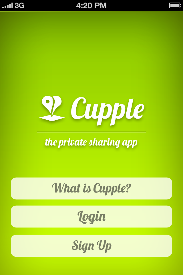
The second brief is for a company called Darling Dash. They are the company behind a new an exciting app called Cupple, which is a private sharing mobile app designed specifically for two people in a relationship. Think a confidential Facebook only you and your partner can access, all the sharing without none of the privacy issues.


I haven’t yet got the official brief from this company yet but it will be based around their app, I think they would welcome any ideas that could help further advance the app and they also expressed that they would like ideas for there sticker packs that they sell through the app. I know they are also interested in promotional materials and especially t-shirt and poster designs that would help promote the brand.

The third brief is for a brand that I had never heard of before today Bad Boy. Bad Boy is an alternative sport and lifestyle brand revolving around mixed martial arts.

They are notable for their presence in both fashion and performance equipment for this sport. This brief although not usually my thing does sound quite good, I’m not into sporty clothing and have never owned a pair of joggers myself but never the less I think I could come up with some good designs and ideas for a line of products for the Bad Boy brand.

So now that I have got my third brief, this week will consist of getting into some early research for all of them but I have to juggle this with starting my contextual studies essay which I want to start writing soon. I also want to make sure that this week I update my blog a bit and publish a few more posts on some cool stuff I’ve seen. Next Monday I will be starting a work placement for a few weeks so I have to start to learn how to juggle multiple projects as I will be going to a company during the day and in my own time I have to start making head way on the 3 briefs so learning to manage my time will be crucial. ­

24 February 2012

From a children's book to famous last words...

Right so this post all started when I picked up one of my siblings books and started reading. The book is called 'The Terrible Tudors' it is a book done by the Horrible History franchise. The book although for children I found was quite a fun read it has a lot of information on England's history during the Tudor period. It included why Henry VII thought he's married a horse, which terrible torture methods the twisted Tudors used and how an awful Tudor axeman kept botching the job.

After reading the book I kept remembering a particular paragraph on Elizabeth I's death and her last words. For some reason it just kept popping into my head so I googled it (naturally) and found the sentence I kept remembering was...

"All my possessions for a moment of time."

When I googled Elizabeth's last words I found a really lovely illustration done by Oskar Alvardo.


Alvardo did a series of illustrations about people's last words including Joan of Arc.

Since I'm sharing these lovely illustrations I thought it only right I also list some of the other famous last words that I have come across.

Voltaire
"Now, now, my good man, this is no time for making enemies."
Said when asked by a priest to renounce Satan.

Joan Crawford
"Dammit...Don't you dare ask God to help me."
Said to her housekeeper who began to pray aloud.

Pablo Picasso
"Drink to me!"

Charles Chaplin
"Why not? After all, it belongs to him."
When the priest attending his deathbed said "May the Lord have mercy on your soul," 
Chaplin quickly replied "Why not? After all, it belongs to him."

Ludwig Van Beethoven
"Friends applaud, the comedy is over."

17 February 2012

Plan of the week

The plan of this week was to make sure that my work is completely finished before I hand it in. I have met all my goals for this week and submitted it today. I really liked this brief given by Pentagram. It was my first foray into the world of editorial design, and I learned a lot form this brief. 

I have definitely improved my editing skills by designing my own two page spreads and I am definitely more confident when it comes to creating unique and hopefully beautiful layouts. Since this brief is now finished I'm going to doing some posts on some of the designers that I have come across during my research and I will also put up my final supplement designs. 

11 February 2012

Plan of the week

So the plan for this week was to completely finish my basic layout plan for the supplement and then get started on creating the content and deciding what images to include.

Thankfully I have completed all of my allocated tasks for this week I have...

  • Finished my basic layout.
  • Chosen a suitable designer.
  • Researched my chosen designer.
  • Decided on content
  • Decided on images.

Because I have done all of my tasks for the week I'm also at the point where I have my final outcomes for this brief. I'm not at the point where my supplement is 100% perfect for me yet but I thought I'd put some images up of what they look like now.


My designs may change slightly when it comes for the final outcomes as they're not completely ready yet but this is the general look of some of my pages.

So onto next week. Since I'm nearly done on this brief next week will mainly consist of making sure that my final outcomes are completely perfect. I also plan on going over my written sketch work. This includes all my research, ideas and development, I must make sure to include all of the drawings and work I have done for this brief.

30 January 2012

Plan of the week

So only my fourth 'plan of the week'. The plan for last week was to really start thinking and exploring some of my own initial idea for the brief, which I have done. During the week I looked at some ideas for the front cover of the editorial supplement and how I can incorporate the logo, as the brief says I must include it. I also started to make a very rough draft of my layout and started to create measurements and layouts.

So onto this week. Well I plan to completely finish my basic layout plan for the supplement and then get started on creating the content and deciding what images to include. To do this I must choose a specific designer that who has worked with the typographic circle, which will require a lot of thought and research. Once I've chosen my designer I will then move onto putting all the content into my layout design.

Next Monday I'll review on the plan has gone and if I have achieved all that I have set out to do.

Digital Skills - Photoshop

Another digital skills lesson so I thought I'd post what I did. This lesson started in Illustrator using the type tools to create a giant 'N' and then placing my name inside it at different sizes and angles. I then moved it into Photoshop where I learnt a lot about how to use textures, which was something new as I've never tried it before. I didn't get time to completely finished the 'N' but I liked this lesson and I learnt some new things about Photoshop. 

23 January 2012

Plan of the week

So this is my third 'plan of the week'. Last week was all about getting research for the new editorial brief which was fun actually, the magazine the brief is about is definitely out there and I haven't personally ever read it but it had very interesting layouts and spreads.

All my research that I decided to do in the second plan last Monday is finished, and the plan for this week is to really start thinking and exploring my own initial idea for the brief.

Next Monday I'll review on how my initial ideas have gone this week and how far I have got in the brief.

Bistro Branding - Evaluation

Project Reflection (Using SWOT)

What did you enjoy about the project?
I enjoyed trying my hand at branding as I've never tried to brand anything previously before.

What you didn't enjoy about the project?
I think I enjoyed every part of this project, I enjoyed sue parts more that others but that is to be expected in briefs.

Have you encountered any problems?
I had some problems when it came to using photographs as I didn't want any copyright issues but this was easily solved by me taking my own photographs.

What went well?
The photographs that I took turned out very well.

What didn't go well?
I won't say this went well but I think my layouts in the stationary set like the complement slip could of went better, I think it would of been greatly improved but back then I didn't know how to use InDesign back then. If I did it again I think it would be better.

New skills acquired?
I lean red some new techniques for Illustrator such as clipping masks.

Did my time management go well, did I hit the internal deadlines?
I think this project was very well managed when it comes to time and I hit the deadline and and everything ready to hand in before the deadline.

Brief - Bistro Branding

In this brief we were given the task of rebranding the Staff Bistro at Rye Hill. This brief included creating a logo, a full stationary set and a menu design.

Before getting into the brief I had to do some indepth research if I was going to design my own logo. This really was an eye opener as it was helpful to see what makes a successful logo that can be decades old but never seem out of date. I found out through my research that the key to a timeless classic logo was a simple but effective idea, a prime example is the Nike swoosh logo it was designed in 1971 by Carolyn Davidson but still look great on their products 40 years later.

Once I decided on a name to brand the Bistro I started out with some very rough logo ideas.


I liked the idea of the logo being the first letter of the Bistro's name, so once I had decided on an idea I developed it further.


I had quite a few variations of my logo design but in the end I went with the original sketch that I drew at the early stages of my designs.


When I decided on my final logo design I experimented with some colour themes but I knew that if I specifically picked a colour for my logo then it wouldn't be very flexible when it came to different colours I could use in the rest of the branding.


I decide that to be as flexible as possible I would have my logo in black and I could use modified versions in the branding if it called for it. Like the two other versions, in one I used a clipping mask to create the logo but with a picture of some grass that I took as the fill, but if didn't work I had a plain green version as well.

After my logo design was finalised I moved on to stationary design. I knew that I probably wouldn't have a very busy and detailed stationary set because I naturally go with more minimal designs. I decided not to use a lot of colour in the stationary set and instead used a lot of white and some pictures that I took myself for the reverse of my stationary.


Looking back I am quite pleased with my final outcomes especially since it was the first brief we were given in the FdA course. I like my stationary designs and I'm glad I managed to incorporate my own pictures instead of just using stock images. This brief was all about creating a brand and I think my final outcomes have that sense of unity, in they have a look and feel that link them together as a brand should.

17 January 2012

Editorial Task & Digital Skills

In class we were given a task to help with the new editorial and typographic brief. We learned how to set up a basic 2 page spread and all the measurements that you use. I then looked through some magazine and mocked up a spread of my own.


This is a photograph of the first double page spread that I designed. After I tried it roughly on just paper the class then moved on to trying it on the computer in a digital skills lesson.

This is my final digital spread that we did in the lesson.We used Indesign which was hard to get the hang of first but after you master the basics its quite simple and an easy tool to use when it comes to creating a spread.

16 January 2012

Plan of the week

So this is my second 'plan of the week' and its actually Monday this time. So looking back, I did all the research that I planned to do last week.

This week the plan is to really start the new editorial brief that the class has been given. Do some research into the magazine that its for, and the people its about. Once I've looked at all my research I can get down to generating ideas and trying things out myself.

Next Monday I'll review on how my research has gone this week and how far I have got in the brief.

12 January 2012

Penguin Illustration - Evaluation

Project Reflection (Using SWOT)

What did you enjoy about the project?
I've got to say I enjoyed it all, from the research on Penguin (who I love) to trying at create my own illustrations.

What you didn't enjoy about the project?
Nothing

Have you encountered any problems?
There were a few technical difficulties when it come to cutting out my intricate scenes but I think I over came them all.

What went well?
I think my final book design went very well and I love the colors I picked.

What didn't go well?
Nothing I can think of.

New skills acquired?
I learned a lot about channels in Photoshop as it was my learning about this program that allowed me to be able to manipulate the color of my book design. I can use my digital skills lessons as opportunities to further improve my skills in specific programs such as illustrator and Photoshop.

Did my time management go well, did I hit the internal deadlines?
I think this project was very well managed when it comes to time and I hit the deadline and and everything ready to hand in before the deadline.

Penguin Illustration

The Penguin Design Award is an opportunity for students on an Art or Design course or degree level to engage in design for publishing during their studies. The brief is to design a whole new cover look in order to reinvent the children's book 'Grimm's Fairy Tales'.

This brief is to be Illustration lead with a strong use of typography, during my research I saw some strong designers who used a lot of detail in their work and it made me think about some of my past projects and the fact that I tend to be on the minimal side naturally when it comes to ideas and designs. So with this in mind I wanted to really push myself to try new things for this brief and get out of my comfort zone.

What lead my ideas and gave me inspiration in this brief were particularly Rohan Easons black and white drawings and the technique of drawing a detailed scene and then carving it out on paper. I started out trying to do a very basic tree scene as I wanted it to be in some way visually linked to the brothers Grimm.

So this is an photograph of the basic scene I drew and then cut out.

But since I cut out the whole thing I knew I needed some kind of background, so I used the large light box in the classroom as I kind of luminous backdrop. I actually really liked this visual and my ideas just progressed from there.

The next thing I did after the tree scene is think about other scenes I could design and then cut out.

So I started to draw a scene, since it was to be a book cover I had to have some text in there. I found a really nice Sans fonts that was perfect for this project and arranged to how I wanted it.

After I found the right font to use I started to draw the scene around it, there was so many things that people associate with the brothers Grimm fairy tales and that are mentioned in the books. The archways at the top of this scene is from my favorite Grimm Fairy Tale 'The Twelve Dancing Princesses', it is the entrance to the secret underground castle where the princesses sneak away to every night to dance with the twelve princes. I had to add a little something from one of my favorites.

This is a photograph that I took to document the process of me cutting out my entire scene and yes it took forever.

My finished cut out scene
When I finished cutting my entire scene I then put it on the light box just like the tree's and took photographs to get the lighting effect how I wanted. I really like this image and all the cutting out was worth it because it worked out exactly how I wanted it, a lovely fairy tale scene with very dreamy lighting.

I wondered what it would look like in black and white so I decided to see what would happen if I scanned the cut out image.

This is the digital image that I got when I scanned the cut out into the computer then used Photoshop to invert the colours, I liked the black and white picture but it lost the dreaminess the original one had.

I decided to try designing another cut out scene since the first one was just a very rough draft.

Front cover

This is the second cut out image I designed. This time I focused solely on a wooded scene just like my original inspiration. I used the same text placement and font as the first scene as I didn't want that to change, but I also took care to create room on the bottom of the page for the names of the brothers as Penguin stated they should be there. I also took the time to create the spine of the book as well since the brief stated it was to create the whole book.

Spine

And lastly I designed and cut out a back cover to finish off the entire thing.


I then used all these images and digitally put them together to create the whole cover look.

Final design

This is my finished cover look for the Brothers Grimm book. Originally I was going to leave the back light alone but once they were all together the book looked old and outdated and kind of reminded me of the colour or porridge, so instead I decided that if I used traditional methods to create the cover, since its all hand carved and there isn't a straight line in sight, then I should use a modern bold colour as a contrast against the old worldly cut out, the bold red/pink colour keeps the traditional method of cut out still looking fresh.

Penguin Illustration - Research


I'm going to be doing a few posts about a brief that I've already completed. It was an Illustration brief for Penguin, but before we get into that I wanted to show some of the images and different designers that I came across when I looked deeper into Illustration and what different types of Illustration styles are out there.


These are some images by a Illustrator called Rohan Eason, I love the drawings he does, the detail he goes into is wonderful and the fact that they all hand drawn makes it even better in my mind.


Here is some work by a very talented lady Sophie Henson. I've seen some of her covers a while ago but I never knew her name, she does some really beautiful drawings with such a light hand when it comes to colour but for her it works.

Another Illustrator that I came across who has a unique style was Damien Tran, I like the way he uses a lot of layers and texture in all of his work but also doesn't forget about real photo's.

Just My Type


Just My Type - Simon Garfield

Just a post on a book I'm reading, full of stories about fonts. It explains why we are still influenced by type choices made more than 500 years ago, and why the 'T' in the Beatles logo is longer than the other letters. It has a chapter on how Gotham helped ease Barack Obama into the Presidency, and it all begins with a cautionary tale, a story of what happens when a typeface gets out of control.   

Lovely Labels


Just some nice labels I have lying around the top one is from Peoples Market, the bottom one is from a company called Atticus.

www.peoples-market.com

www.atticusclothing.com